I wouldn't be surprised if Typographical-Grocery-List shopping was the next biggest thing for the pratt kids livin near Myrtle. Milk does look a little more important in Cooper Black. Check out more at Shopping Losts
Okay, to the regular designer, its a bit "wrong" to use themed and free typefaces. But, I use them when I make them my own and manipulate or alter them in some way. I never use them the way they are given just to make something look themed to suit its purpose.
1. EGYPTIENNE ZIERINITIALIEN
Used this for a circus-themed project for packaging design. Its highly ornate (but beautiful) -there wasn't much I could do with it, except combine it with other typefaces for that circus poster look. The image above I found from a tote bag design while blogging.
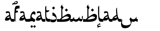
2. AFARAT BLADY
Used this for a graphic design proj, but my-oh-my, I had to Adobe Illustrate the shit outta this one. In the end: so worth it.
3. ECUYER DAX
This one provided a good basis for a money font plus another one I found. Really, who wants to find a way to draw these characters yourself when you can fuck around with these ones already made for you? (I tried photoshopping a dollar bill as well-did not work.) This one was free, there's a better one that is more expensive, but this works for now.
Yeah they are free and supposed poorly-designed and whatnot, but they are specialty typefaces you can use as a foundation. they come in handy - in the end, you are the designer.
Almost made the cut: Gotham, Edwardian, Ms. Eaves, The Sans, Base Twelve 09 Shit List: Futura, Helvetica Neue, Gill Sans
I've used these fonts in my recent work and it has paid off big time. Especially the entire extensive family that each font has, including the condensed/compressed, light/heavy styles. If you would like any of these fonts, feel free the contact me and I will give it to you.
My GD prof sent us this exhibit. I'm going to go see it. It is at the Cooper Union, its a typography exhibit, Lubalin Now, featuring many innovative designers inspired by the famous typographic master, Herb Lubalin
CHECK ZII OUT.
A new work by one of my favorite designers, Mario Hugo. Doing a proj on this for type class. I love how type and illustration are working beautifully together here.
Very cool wood block type. Wood Block Type is definitely making a major comeback, and is now seen as more contemporary, especially when used in an innovative way such as combining positive and negative space as seen above. The print above was created by designer Nick Sherman.
Tissue Box - very whimsical. I recognized the font, Rosewood.
Delicious wine/chocolate bar and restaurant. today was my second time eating there for lunch. they gave us free sangria and have a nice logo/interior. Please check it out, located west 31st street.
Book covers are amazing. And there are an infinite amount of books with incredible content within them, but not the greatest covers. A book is screaming for a striking cover with something to get the attention of the reader. The best solution for that is use of typography or controversial image or photo.
PLEASE look at this website. it will make you go wild.
http://www.bookcoverarchive.com/
AND THIS ONE
http://lovelypackage.com/
I've been using a lot of DIN and Filosophia Lately.